When it comes to printed designs, colour is not just an option for looks;it is a way to connect, an emotional trigger and an attention magnet. There are a lot of complicated systems that are controlled by specific colour models that make it possible to correctly reproduce colours on paper. It is important for designers, printers and everyone else involved in the print business to understand these models.
The main colour models that affect printed designs are CMYK, Pantone Matching System (PMS) and RGB. This complete guide starts by looking at CMYK. Come with us as we break down the details, features and meanings of these Colour models, getting to the heart of what makes printed designs truly colourful and powerful.
Table of Contents
ToggleWhat Is Colour Model

In the dynamic world of printed designs, the impact of Colour cannot be overstated. It is not merely a visual element but a powerful tool that communicates messages, stirs emotions and captures attention. The intricacies of Colour reproduction involve specific Colour models, each with its unique characteristics. This in-depth guide delves into the primary Colour models shaping the landscape of printed designs: CMYK, Pantone Matching System (PMS) and RGB. If you want to know more about Printing you can read this guide What is the Difference Between Screen Print and Digital Print. Let’s explore each in detail:
- CMYK Colour Model
- Pantone Matching System (PMS)
- RGB Colour Model
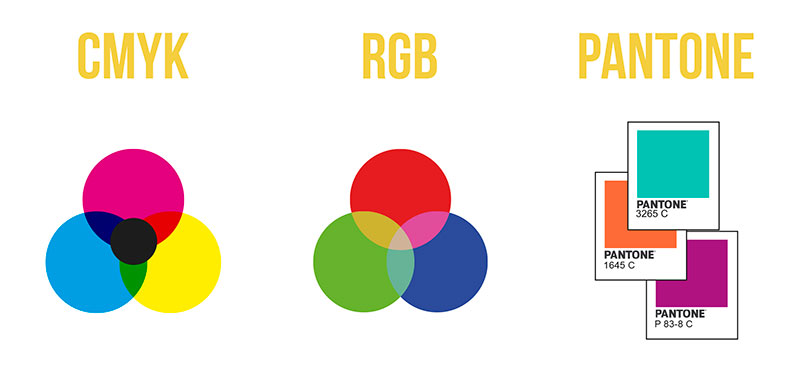
1. CMYK Colour Model:
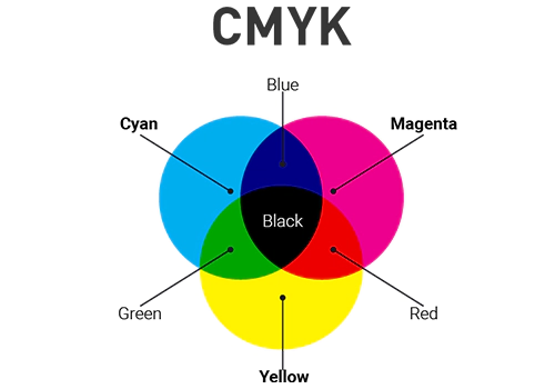
At the core of Colour printing lies the CMYK Colour model, also known as the process Colour model. Its foundation rests on the interplay of four ink Colours – Cyan, Magenta, Yellow and Key (Black). Understanding the roles of each component is vital:
- Cyan (C): This blue-green hue absorbs red light and is instrumental in producing shades of blue and green in printed designs.
- Magenta (M): Absorbing green light, magenta is indispensable for creating vibrant reds and purples in the Colour spectrum.
- Yellow (Y): Absorbing blue light, yellow compliments cyan and magenta, contributing to the creation of oranges and various shades of green.
- Key (K): Represented by black, the key Colour enhances contrast and ensures the crispness of text and images. You can also read this guide Frustration-Free vs Standard Packaging.
2. Pantone Matching System (PMS):
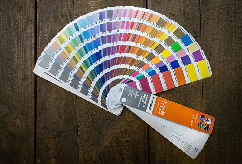
For precise Colour replication and consistency, the Pantone Matching System (PMS) takes center stage. Developed by Pantone, this Colour model offers a standardized set of Colours, each assigned a unique identification number. Key features include:
- Colour Accuracy: PMS guarantees exact Colour replication across diverse materials, vital for maintaining brand consistency.
- Wide Colour Range: With thousands of predefined Colours, designers have a rich palette for precise Colour selection.
- Specialty Inks: PMS introduces specialty inks like metallic and fluorescent Colours, expanding creative possibilities.
Read More: Correct Way to Read Product Dimensions?
3. RGB Colour Model:
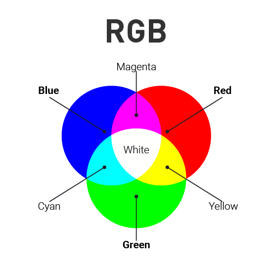
In the digital realm, the RGB Colour model takes the spotlight, relying on the additive Colour process. Red, Green and Blue light combine at varying intensities to create a spectrum of Colours on screens. Key aspects include:
- Additive Colour Mixing: Combining red, green and blue light results in a diverse range of Colours, making RGB ideal for digital displays.
- Digital Displays: This model is perfect for graphics seen on monitors, cameras and various digital platforms. You May Also Like: How Much Does a Cardboard Box Weigh?
Choosing Between CMYK, PMS and RGB:
Selecting the appropriate Colour model for a printed design project involves considering multiple factors:
- Budget Considerations: CMYK is cost-effective for large print runs, whereas PMS may incur higher costs due to the use of specialty inks.
- Colour Precision: PMS is the preferred choice when precise Colour matching is paramount, especially for branding elements.
- Digital vs. Print: While RGB suits digital designs, CMYK or PMS is the go-to for tangible print projects.
Conclusion:
Mastering the intricacies of Colour models in printed designs is fundamental for achieving desired outcomes in terms of Colour accuracy, consistency and cost-effectiveness. Whether opting for the versatile CMYK model, the precision of the Pantone Matching System, or navigating the digital landscape with RGB, designers and printers must weigh various factors to determine the most suitable approach for each project. By leveraging these Colour models effectively, stakeholders can ensure visually stunning and impactful printed materials that resonate with their audience, leaving a lasting impression in the competitive world of visual communication.
You Can Also Read Our Latest Guide:
FAQs:
Printed designs are typically in the CMYK colour mode.
The CMYK colour system is used for printing designs.
The CMYK colour model is indeed used in printed designs.
The printing industry primarily uses the CMYK colour model.
It is not recommended to use RGB for print; the preferred choice is the CMYK colour model.